
A login page is a fundamental part of any website that requires authentication. A well-designed login page ensures a seamless user experience and enhances security. In this blog post, we’ll guide you through designing a stylish and fully responsive login page using HTML, CSS, and JavaScript.
Step 1: Structuring the HTML
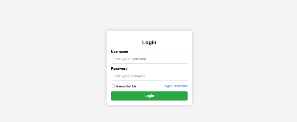
The first step in building a login page is structuring the HTML. We’ll create a container for the login form and add input fields for the username and password. Additionally, we’ll include a ‘Forgot Password’ link and a ‘Remember Me’ checkbox.
<!DOCTYPE html>
<html lang="en">
<head>
    <meta charset="UTF-8">
    <meta name="viewport" content="width=device-width, initial-scale=1.0">
    <title>Login Page</title>
    <link rel="stylesheet" href="styles.css">
</head>
<body>
    <div class="login-container">
        <h2>Login</h2>
        <form id="loginForm">
            <div class="input-group">
                <label for="username">Username</label>
                <input type="text" id="username" placeholder="Enter your username">
            </div>
            <div class="input-group">
                <label for="password">Password</label>
                <input type="password" id="password" placeholder="Enter your password">
            </div>
            <div class="remember-me">
                <div>
                    <input type="checkbox" id="rememberMe">
                    <label for="rememberMe">Remember Me</label>
                </div>
                <a href="#">Forgot Password?</a>
            </div>
            <button type="button" onclick="validateLogin()">Login</button>
        </form>
    </div>
    <script src="script.js"></script>
</body>
</html>
Step 2: Styling with CSS
To make the login page visually appealing and responsive, we’ll use CSS. The form will be centered, have a modern look, and be fully responsive on all devices.
body {
    font-family: Arial, sans-serif;
    display: flex;
    justify-content: center;
    align-items: center;
    height: 100vh;
    background-color: #f4f4f4;
    margin: 0;
}

.login-container {
    background: #fff;
    padding: 20px;
    border-radius: 10px;
    box-shadow: 0 0 15px rgba(0, 0, 0, 0.2);
    width: 350px;
    text-align: center;
}

.input-group {
    margin-bottom: 15px;
    text-align: left;
}

.input-group label {
    display: block;
    margin-bottom: 5px;
    font-weight: bold;
}

.input-group input {
    width: calc(100% - 20px);
    padding: 10px;
    border: 1px solid #ccc;
    border-radius: 5px;
    font-size: 16px;
    display: block;
    margin: 0 auto;
}

.remember-me {
    display: flex;
    align-items: center;
    font-size: 14px;
    margin-bottom: 15px;
    justify-content: space-between;
}

.remember-me a {
    text-decoration: none;
    color: #007bff;
    font-size: 14px;
}

.remember-me a:hover {
    text-decoration: underline;
}

button {
    width: 100%;
    padding: 12px;
    border: none;
    background-color: #28a745;
    color: white;
    border-radius: 5px;
    cursor: pointer;
    font-size: 16px;
    font-weight: bold;
}

button:hover {
    background-color: #218838;
}

/* Responsive Design */
@media (max-width: 480px) {
    .login-container {
        width: 90%; /* Adjust width for smaller screens */
        padding: 15px;
    }

    .input-group input {
        width: 100%; /* Full width input fields */
    }
}
Step 3: Adding JavaScript for Form Validation
A simple JavaScript function is added to validate user input before submitting the form.
function validateLogin() {
    let username = document.getElementById("username").value;
    let password = document.getElementById("password").value;
    if (username === "" || password === "") {
        alert("Please enter both username and password.");
    } else {
        alert("Login successful! (Demo purpose only)");
    }
}
Making the Form Fully Responsive
To ensure the login page works well on all screen sizes, we included a media query in the CSS file. This ensures that on smaller devices like mobile phones, the form adapts by adjusting its width and padding.
Why These Changes Improve Responsiveness?
✔ Ensures proper spacing and readability✔ Makes input fields adapt to small screens✔ Keeps the form centered and visually appealing